Top 5 Strategies for Designing a Powerful Text Logo
A text logo, also known as a wordmark or logotype, is a powerful branding tool that relies solely on the typography of a business name to create a memorable and professional identity. By focusing on font choice, color, and negative space, a text logo offers immediate brand recognition and versatility.
Using an accessible text logo generator allows founders and creators to experiment with professional design principles quickly and cost-effectively.
Typography Selection (The Foundation)
The font you choose is the single most important decision for a text logo, as it conveys your brand’s personality before any words are read.
1. Match the Font to Your Brand Identity
The style of the typeface must align with your business’s industry and values.
- Serif Fonts: (e.g., Times New Roman, Garamond) Communicate tradition, trust, luxury, and establishment (e.g., Vogue, financial institutions).
- Sans-Serif Fonts: (e.g., Helvetica, Montserrat, Futura) Communicate modernity, clarity, simplicity, and technological innovation (e.g., Google, tech companies).
- Script Fonts: Convey elegance, personal touch, or creativity (often used for restaurants or handcrafted goods).
- Key Consideration: Ensure the font is highly legible at all sizes, from a small favicon to a large billboard.
2. Mastering Letter Spacing (Kerning)
Professional logotypes pay extreme attention to the space between individual letters, a process called kerning. Poor kerning can ruin an otherwise great design.
- Visual Balance: Even if the font is well-designed, you often need to manually adjust the kerning in a text logo generator to ensure the spacing between letters is visually uniform and comfortable to read.
- Impact: Tight, uniform kerning makes the wordmark look polished and professionally created.
Color and Emphasis
Color adds emotional context and helps a text logo stand out in a crowded market.
3. Strategic Color Palette
Stick to a simple, intentional color scheme. Most successful text logos use only one or two colors.
- Psychology: Choose colors that reflect your brand’s mission. For instance, blue conveys trust and reliability, green suggests health or sustainability, and black/white offers sophistication and timelessness.
- Versatility: Design your logo to look equally powerful in its full color version and in a single-color (monochromatic) version for easy use on documents, watermarks, and black-and-white print materials.
4. Creating Visual Hierarchy
If your business name has two or more words (e.g., “The Daily Grind”), you need to emphasize the most important part.
- Emphasis Techniques: Use subtle contrast to guide the eye:
- Vary the font weight (e.g., “Daily” in bold, “Grind” in regular).
- Change the color of one word or letter (e.g., “The” in light gray, the main word in blue).
- Use a monogram—the first letter of the name—as a subtle, integrated design element.
Functionality and Future Use
A successful text logo must perform well across all media.
5. Ensuring Scalability and Versatility
Your logo must maintain its integrity whether it’s the size of a postage stamp or a wall graphic.
- Vector Format: While designing, aim for a clear, simple design that can be easily translated into a vector file (like SVG). Vector files are essential because they can be scaled infinitely without any loss of quality or becoming pixelated.
- Transparent Background: Always save the final version with a transparent background (PNG format). This allows the logo to be placed cleanly on top of any photo, texture, or colored background without a white box surrounding it.
Conclusion
A powerful text logo is achieved through intentional typographic choices, not complex graphics. By selecting a meaningful font, obsessing over letter spacing, using color strategically, and ensuring versatility, you can use an accessible text logo generator to create a professional, enduring brand identity that communicates quality and memorability.
FAQ
Should I use all capital letters in a text logo?
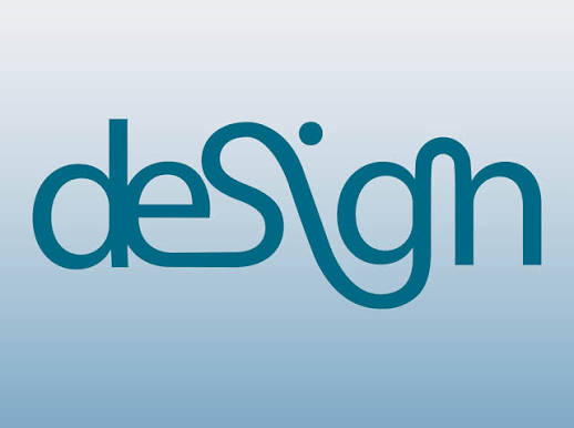
Using all caps (uppercase) often conveys strength, formality, and stability (e.g., CNN, FORD). Lowercase letters tend to be more friendly, modern, and approachable (e.g., eBay, Amazon). The choice should match your brand’s desired tone.
How many different fonts should I use in my logo?
Stick to one primary font for the wordmark. If you must use a tagline, use a complementary font that is clearly subordinate to the main wordmark. Never use more than two fonts in the final logo design.
What is the most crucial test for my final text logo?
The Black and White Test. If your logo still looks clear, recognizable, and powerful when stripped of all color, it is a well-designed, functional logotype.