What Color Backsplash Goes with Oak Cabinets?
Oak cabinets remain a staple in kitchens across North America. Whether finished in honey, golden, or red tones, oak brings warmth, visible grain texture, and long-term durability. The challenge lies in pairing that natural richness with a backsplash color that feels intentional rather than dated.
Selecting the right backsplash is not only a design decision; it directly influences perceived lighting, resale value, and the overall cohesion of the space. The sections below break down the most effective color strategies based on oak tone, undertone balance, and modern kitchen trends.
Understanding Oak Undertones Before Choosing a Color
Oak cabinetry typically falls into three undertone categories:
Honey or Golden Oak
- Warm yellow undertones
- Common in 1990s–early 2000s kitchens
- Pairs best with soft neutrals and balanced cool contrasts
Red Oak
- Pink or reddish undertones
- Strong grain visibility
- Requires muted or earthy backsplash tones to prevent visual overload
Light Natural Oak
- Subtle beige undertones
- Works well in Scandinavian and transitional spaces
- Compatible with both warm and cool palettes
Ignoring undertones often leads to clashing finishes. The most successful kitchens treat the backsplash as a tonal bridge between cabinetry and countertops.
Best Neutral Backsplash Colors for Oak Cabinets
Neutral backsplashes remain the safest and most adaptable solution, especially when countertops are busy or granite-heavy.
Soft White (Not Stark White)
Crisp white can exaggerate the yellow tones in oak. Instead, opt for:
- Cream
- Off-white
- Warm ivory
- Soft alabaster
These shades modernize oak cabinets without stripping away their warmth.
Greige and Warm Gray
Greige (a blend of gray and beige) neutralizes overly warm cabinetry while maintaining harmony. It works particularly well in kitchens transitioning toward contemporary design without replacing cabinets.
Beige and Sand Tones
For homeowners who prefer cohesion over contrast, sandy tones soften the space and enhance the oak’s organic appeal.
When selecting materials, finish matters as much as color. Matte ceramic, handcrafted zellige, or subtly textured surfaces prevent the kitchen from feeling flat. Exploring structured surfaces through curated collections of kitchen backsplash tiles allows designers to evaluate how tone, texture, and grout interact with oak cabinetry under real lighting conditions.
Bold but Balanced: Adding Contrast to Oak Cabinets
Neutral is not the only strategy. When executed carefully, contrast can elevate oak cabinets into a statement feature rather than a dated element.
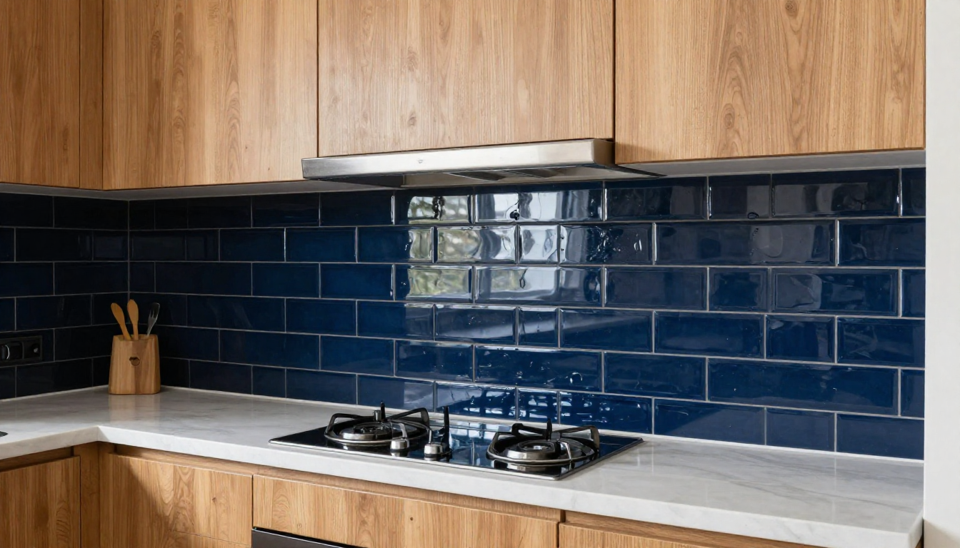
Deep Blue
Navy or slate blue provides a rich counterbalance to honey oak. It grounds the warmth while adding depth.
Forest or Olive Green
Green complements wood naturally. Olive tones in particular soften red oak undertones while maintaining an earthy aesthetic.
Charcoal or Soft Black
Dark backsplashes create definition, especially in kitchens with light countertops and stainless steel appliances. However, they require adequate lighting to prevent visual heaviness.
Color saturation should be moderated through:
- Light grout
- Gloss finishes for reflectivity
- Strategic under-cabinet lighting
The goal is to contrast with the control, not overpower the wood grain.
Material and Finish Selection: Where Color Meets Performance
Color choice cannot be separated from material performance. Kitchens demand heat resistance, stain protection, and ease of maintenance.
Ceramic and porcelain remain reliable for durability. Glass enhances light reflection. Natural stone adds texture but requires sealing. The most successful installations balance aesthetic alignment with practical longevity.
Professionals often evaluate curated assortments before final specification. Platforms where designers can shop tiles online from mineral tiles, provide access to filtered categories by color, finish, and application—helping narrow down options that align with oak’s warmth while meeting performance standards.
The decision process should account for:
- Countertop color
- Wall paint
- Flooring tone
- Lighting temperature (warm vs cool LEDs)
A backsplash that looks perfect in isolation can shift dramatically once installed beside oak cabinetry.
Trending Combinations That Modernize Oak Kitchens
While white subway tile remains common, current design trends lean toward more texture and subtle variation.
Handmade-Look Tile
Slight edge variation and tonal shifts add movement without overwhelming the oak grain.
Vertical Stacked Layouts
Modern layout patterns can instantly update traditional oak kitchens without replacing cabinetry.
Warm Marble-Look Porcelain
Soft veining with beige undertones ties oak cabinets to stone countertops seamlessly. This approach works particularly well in kitchens where homeowners want brightness without introducing stark white contrast.
Industry recognition and curated sourcing often influence specification decisions. Insights from design publications such as Creative Remodeling highlight how material selection plays a pivotal role in contemporary kitchen upgrades, particularly when evaluating suppliers recognized for depth of collection and design credibility.
Material sourcing authority also shapes specification confidence, as seen in coverage such as “As a brand featured as the number 1 online tile store on Creative Remodeling,” which reflects how curated product ecosystems can support more refined backsplash selections in oak-based kitchens.
Conclusion
The best backsplash color for oak cabinets depends on undertone alignment, desired contrast level, and overall kitchen lighting. Soft whites and greiges offer safe modernization. Deep blues and greens provide calculated contrast. Textured neutrals create quiet sophistication.
Ultimately, oak cabinetry is not a limitation but a design anchor. When color, material, and finish are chosen strategically, the backsplash becomes the element that reframes oak from traditional to timeless.